Master Bathroom Update Part II.
As you guys know, I’ve been working on updating our master bathroom for a few months now. The bathroom was never terrible but it was bland and builder-grade and I just wanted to make it feel more “us.”
“before” shot of our bathroom
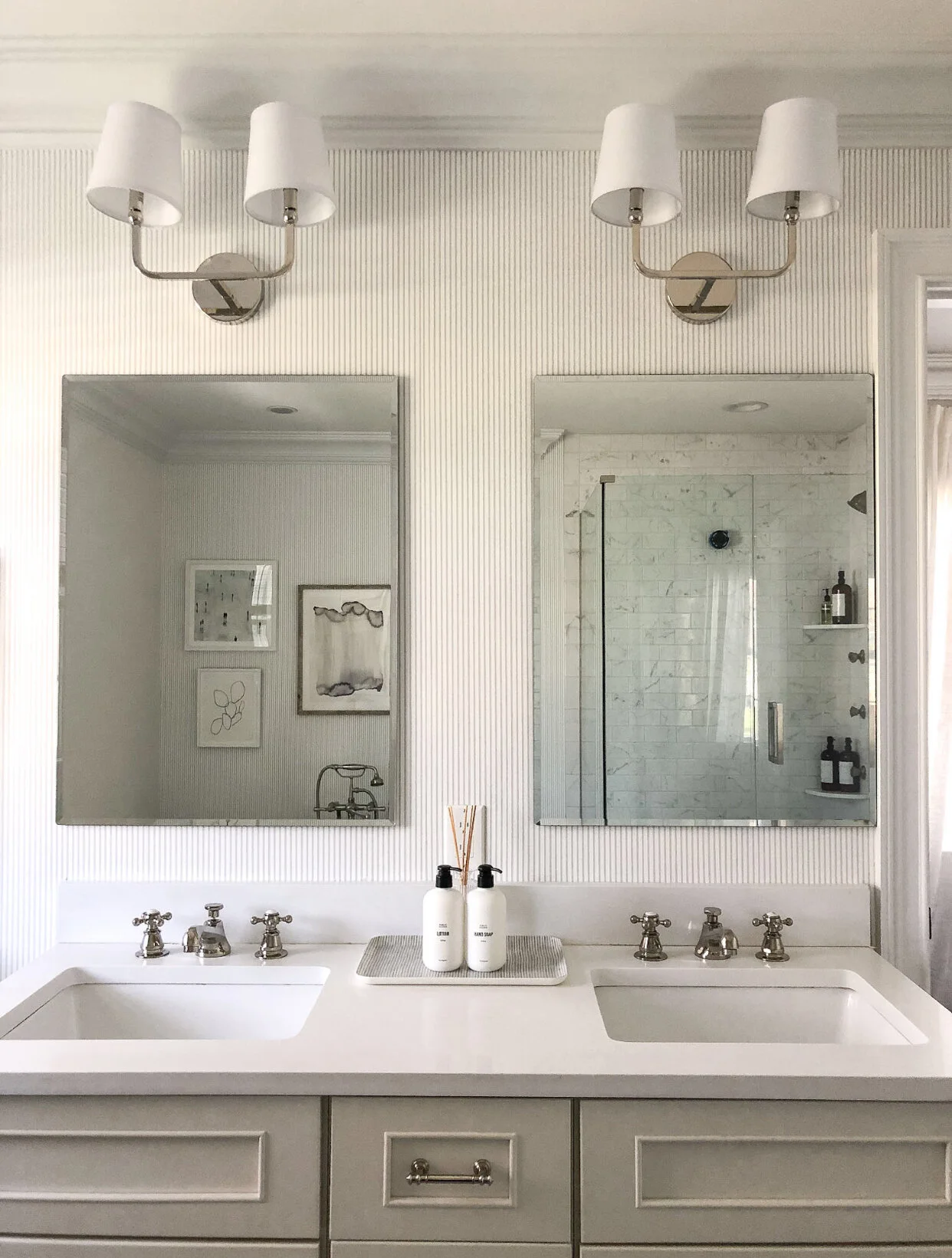
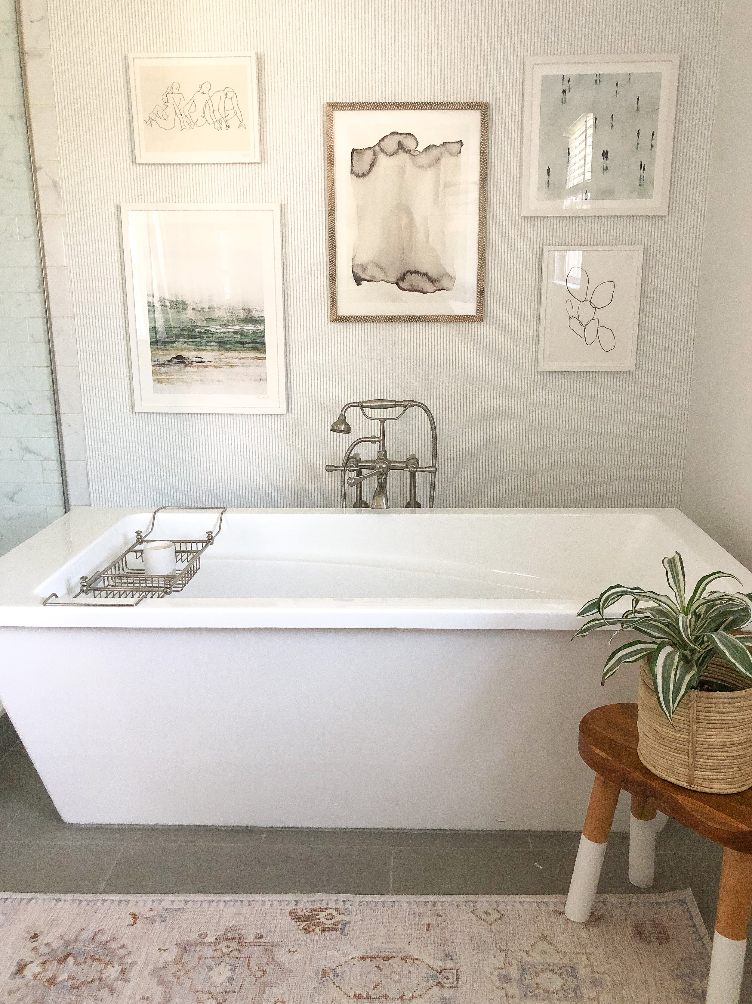
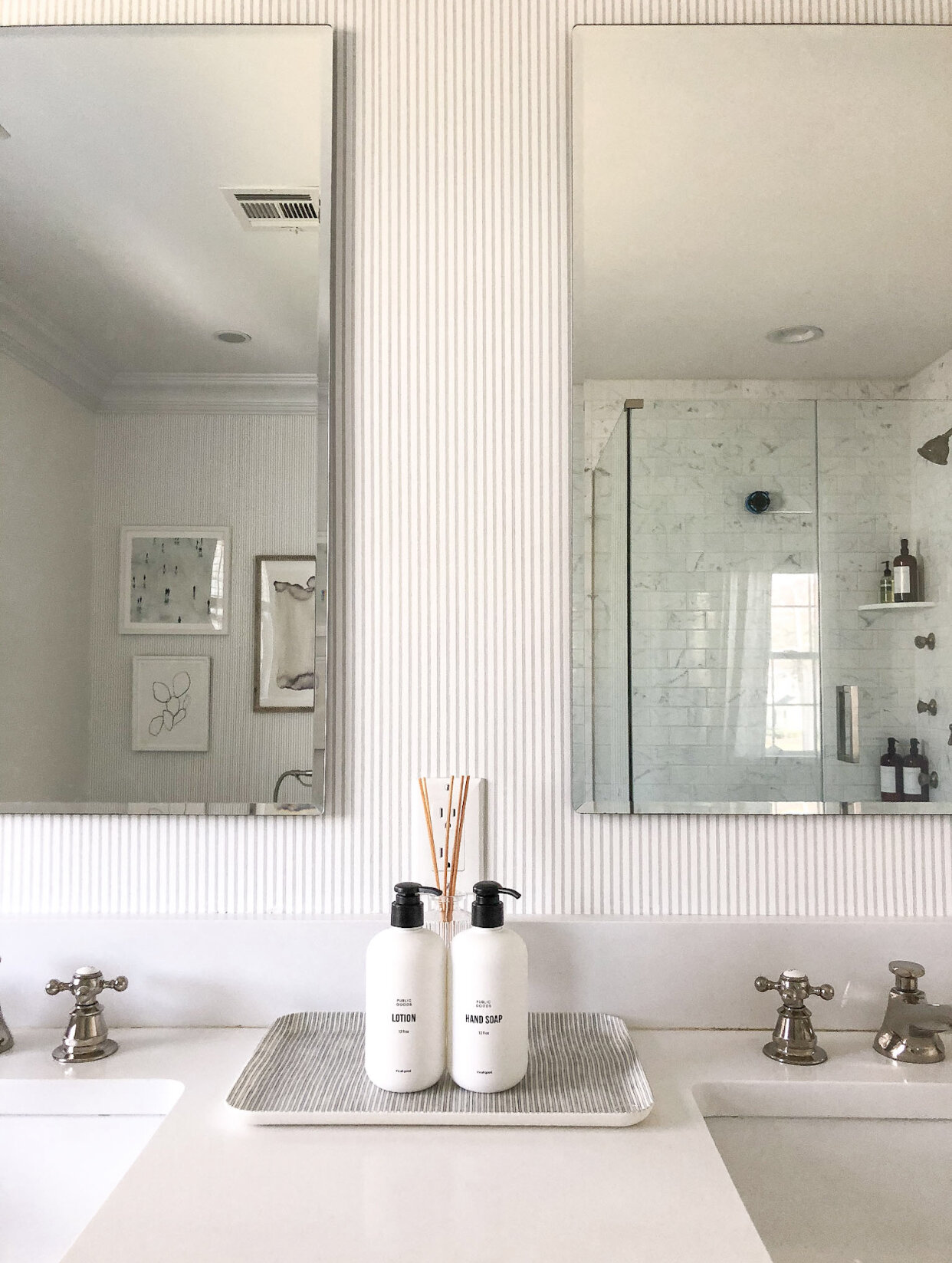
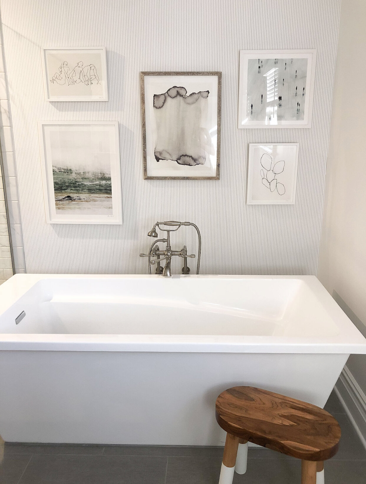
After a brief trial with some peel-and-stick wallpaper (which I loved, but ultimately decided I wanted to go in a different direction), I landed on this gorgeous pinstripe wallpaper from Serena & Lily, which just felt more me. It’s in the color palette that I’m typically drawn to (gray and white) and I love the imperfect lines and the texture that it brings to the space. I decided to install it myself and to use it on just two walls: the wall behind the bathtub and the wall behind out vanities. This is traditional, unpasted wallpaper but it was simple to install (I’ll show you guys in a separate post).
First, I peeled off the peel-and-stick wallpaper that we had on the walls and gave the side walls a fresh coat of paint. They were originally painted Benjamin Moore Silver Chain (a light gray) but I wanted them brighter so I decided on Sherwin Williams Nano White, which is a nice bright white.
I only painted the side walls because I knew that I would be adding wallpaper to the other two walls. I painted two coats of paint and let it dry overnight. If I was wallpapering over these walls, I would have waited a few weeks to allow the paint to cure, but since I was only adding wallpaper to the non-painted walls, I went to work installing the wallpaper that same weekend.
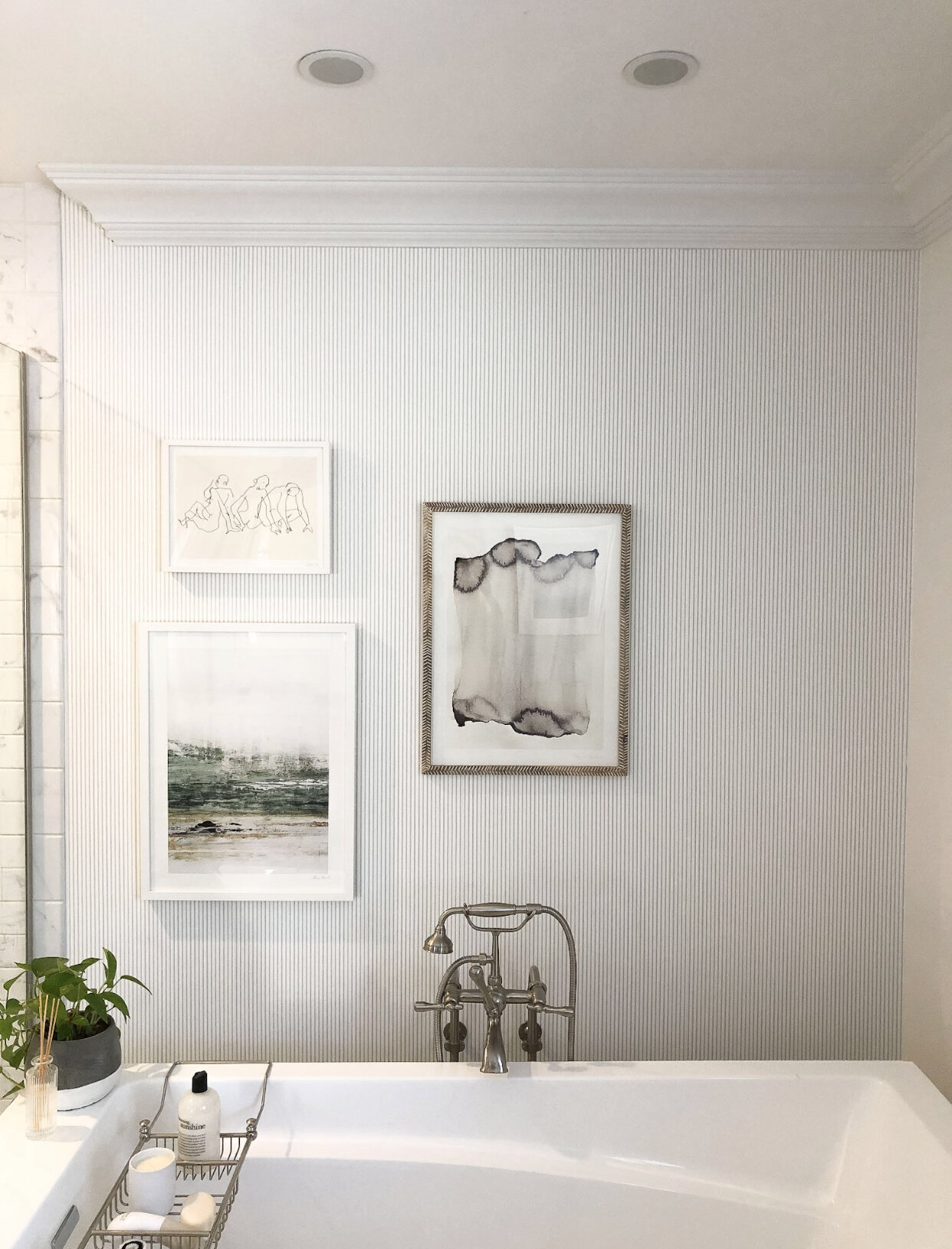
I let the wallpaper dry completely overnight and then went to work hanging a little gallery wall above the bathtub. Our master bathroom is fairly small so I wanted to give the vibe of a boutique hotel through the wallpaper, artwork and fixtures that I updated.
All of the artwork in this gallery wall is from Minted and I’m linking it below for you guys.
I love sourcing artwork from Minted because doing so allows me to choose unique pieces that I can customize by size and frame. And every purchase directly supports Minted’s community of independent artists.
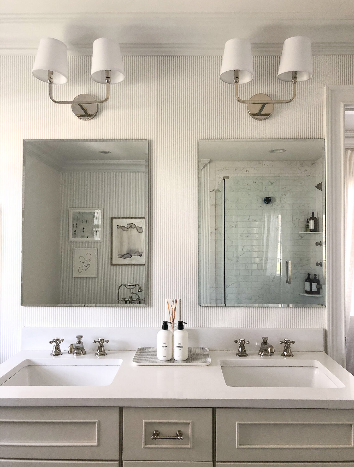
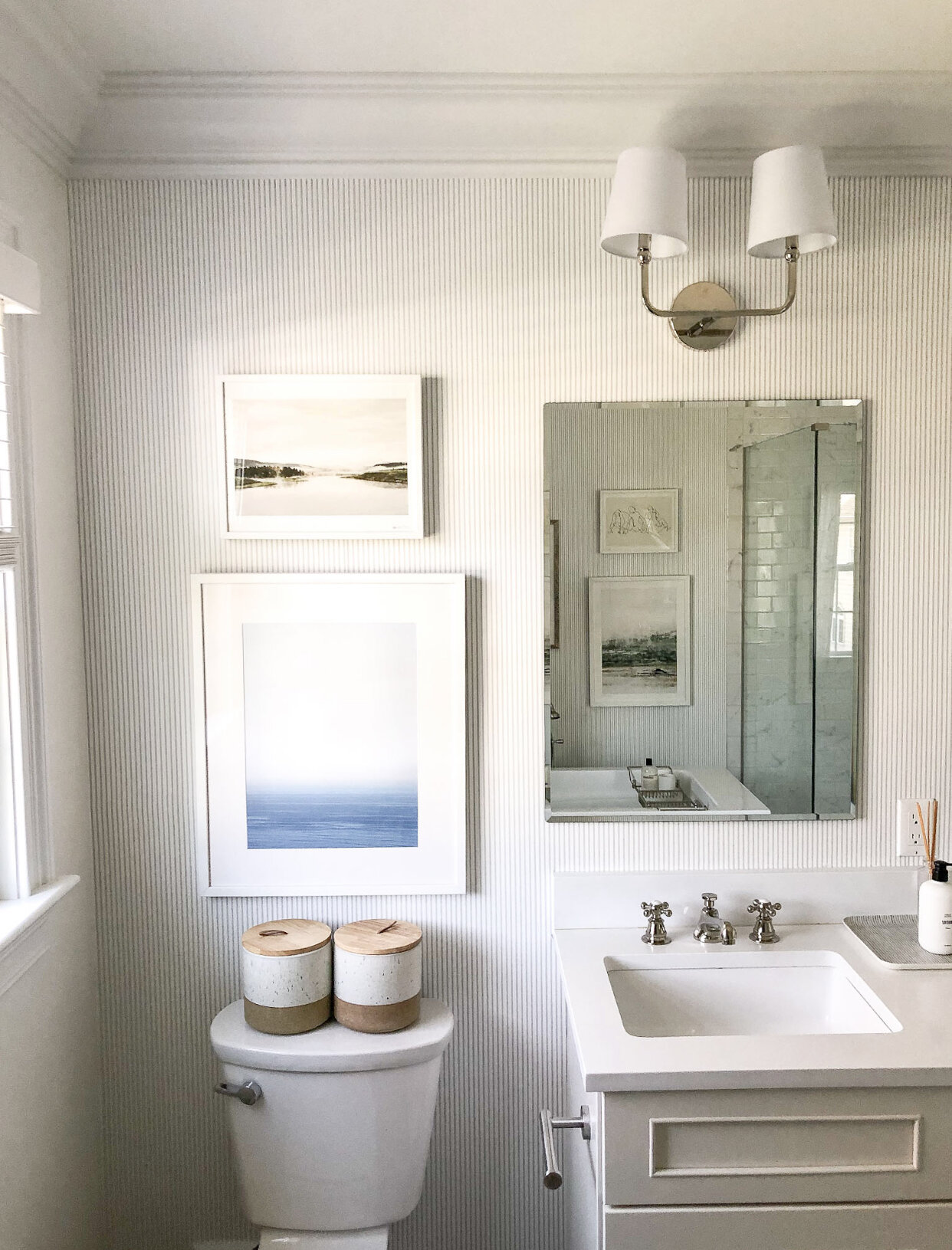
I swapped out our old sink faucets for something more traditional and hotel-like and also replaced the original sconces for a new look.
a quick look at the old vanity lighting…
I went back and forth between a few sconce options but ultimately chose these because they were so cost-effective and the reviews were great and so far, we absolutely love them! Such a traditional style but with a modern twist.
The last step was to add a bit of artwork above our toilet to fill the space between our vanity and the window. Despite already having a lot of artwork in the room, I wanted to make sure that the space felt balanced, so I pulled artwork for this wall as well. The smaller piece on top is from Minted but the larger photograph is a stunning piece from Caroline Pacula, which I’ve had for some time and was just waiting for this space to be complete so I could hang it up! I love that it’s neutral and calming
Aside from the artwork, which I linked to above, here are all of the products I used to update our master bathroom:
Sharing more photos below. Would love to know what you guys think!!


