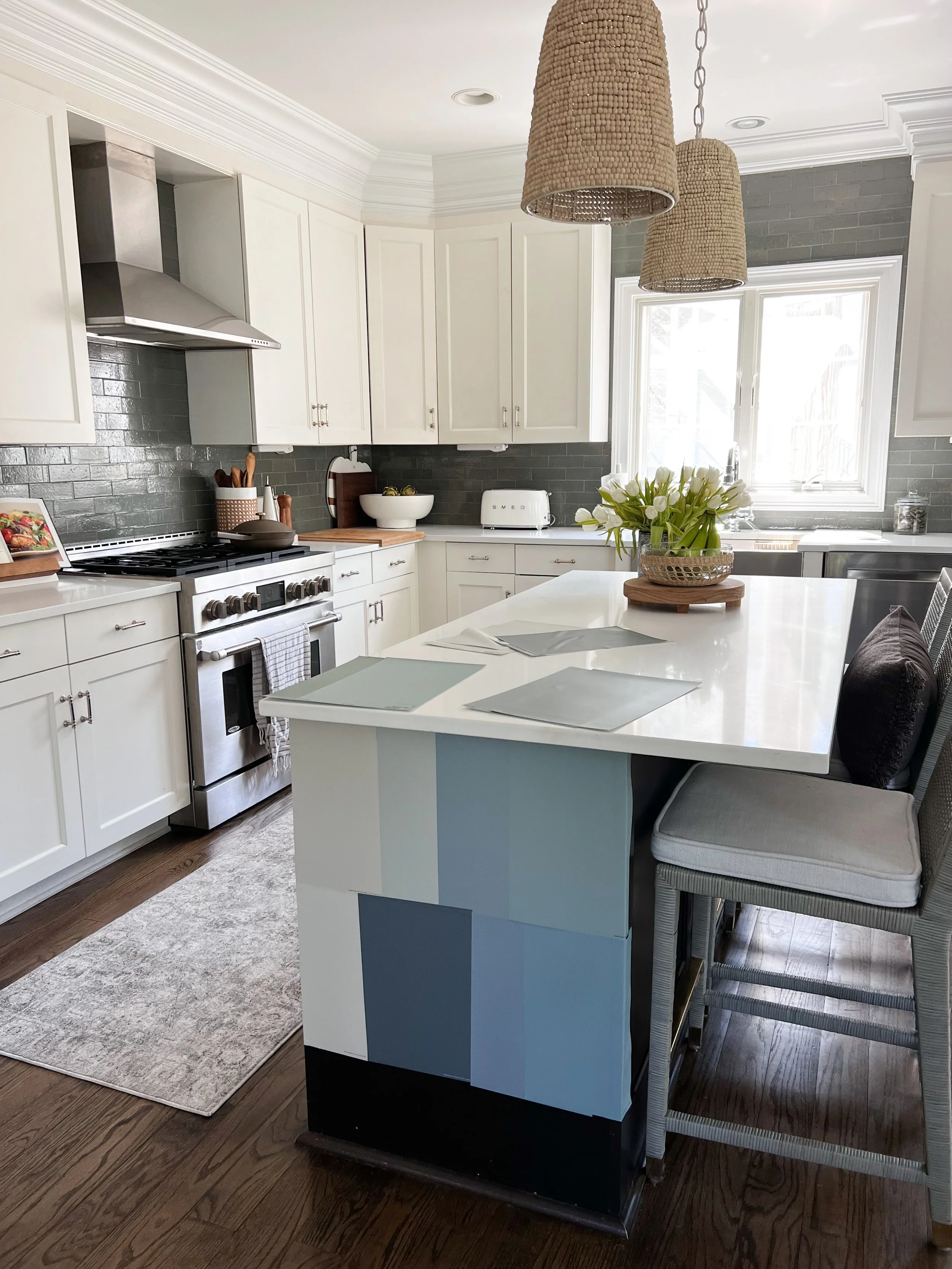
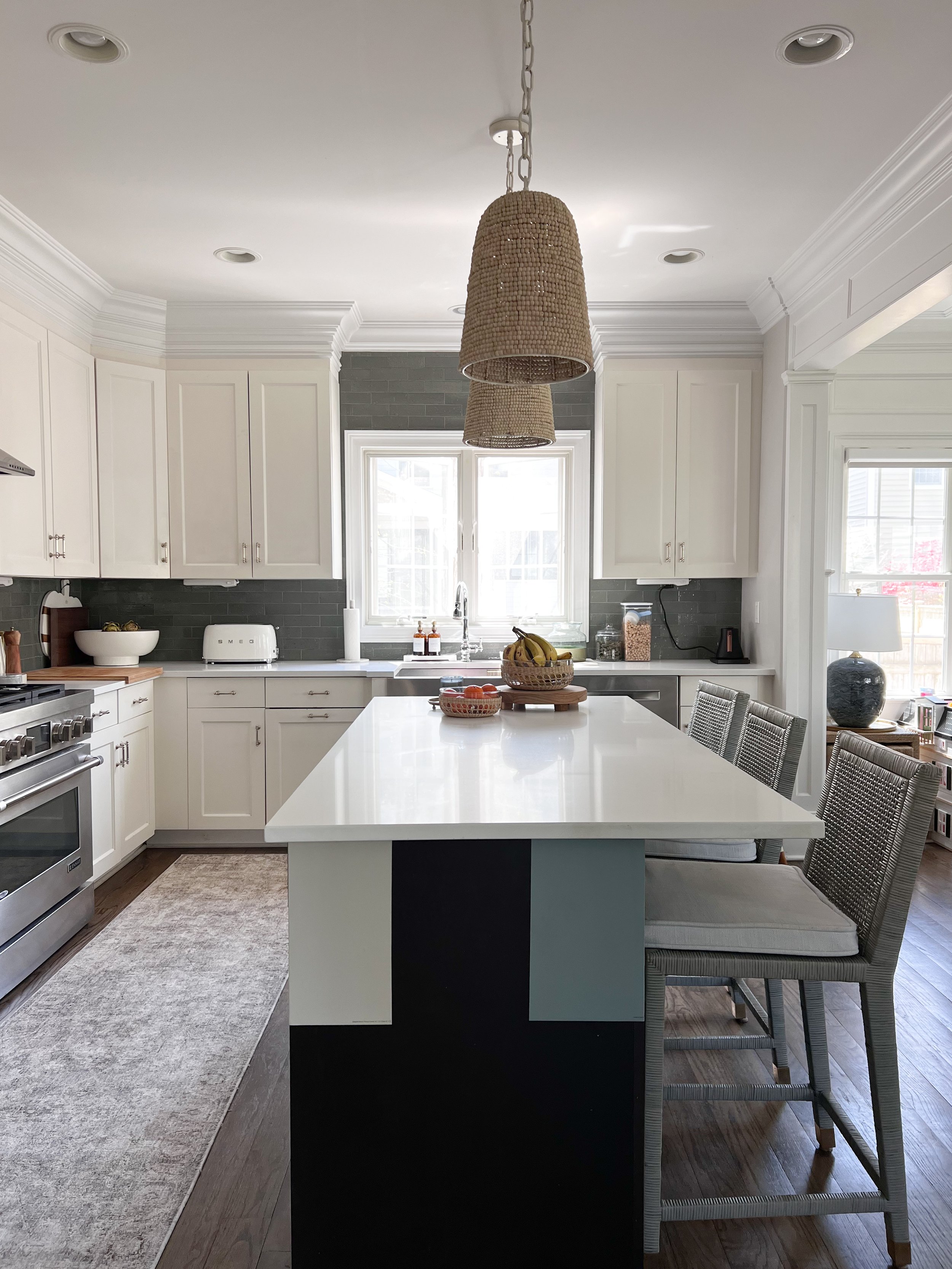
Painting Our Kitchen Island With Help From Samplize.
Ever since we first moved into our home (nearly seven years ago!) I’ve had plans to paint our kitchen island.
This blog post is sponsored by Samplize and includes affiliate links, which means that I receive a small commission if you shop through my links without any additional cost to you. All opinions are my own!
First, a little background on our home: This house was a brand new build, which we are so thankful for. However, we weren’t able to choose any of our finishes. So, over the years I’ve been making changes such as swapping out light fixtures, repainting rooms, adding wainscotting and decorative trim, installing wallpaper, and most recently, replacing our kitchen backsplash. We originally had glossy white subway tile, which I replaced with the coolest glazed brick in a pretty “mist” colorway.
My goal has always been to inject personality, pattern, texture and (some) color so that this home feels like us. With that said, one part of our kitchen still feels “off” to me and it’s our kitchen island.
The island has a dark brown finish which, in my opinion, makes our kitchen feel dark and small – so I’ve had dreams of repainting it a color and that project is what I’m planning to share with you today!
My go-to when testing paint has always been Samplize so when they reached out to ask if I’d be interested in working together on a project, I immediately said yes!
I love that you can browse Samplize.com and choose from over 7,000 peel-and-stick paint color samples from all of your favorite brands (Benjamin Moore, Sherwin-Williams, Farrow & Ball, and PPG, to name a few).
I naturally lean toward cooler tones so I knew that I either wanted to pull in more blue/green from our backsplash or go with a more muted light gray – but choosing a color can be tough!
One of the questions that I receive most often from followers and clients is how to choose a paint color and my answer is always the same: Look around your home and take note of the colors already present that make you happy. It can be colors in art hanging on your wall, a rug on the floor, throw pillows on the sofa or bed, or in my case, the color of the tile on our kitchen backsplash!
Still, even though I knew I wanted a blue or a green tone, there are hundreds of colors to choose from. I started with a few quick searches on Samplize.com, first typing in a general “blue gray” in the search box and following it with searches like “blue green” and “light gray.”
When the paint colors popped up, I started adding the ones that I liked best to my shopping cart and eventually edited a few out until I was left with several colors that fell into one of three color groups: blues, greens, and grays. Here is the final selection of samples that I ordered!
The best part is that Samplize samples ship the next day, which is wonderful for impatient people like me – and it allows you to receive all of your samples while the project is fresh in your mind.
I immediately got to work peeling and sticking the samples around our kitchen island.
Each sample is made with two coats of real paint so you know that they’re the true paint color and can be stuck to a surface, peeled off, and repositioned easily and without any damage.I love that the samples are big (9’’ x 14.75’’) so you can really see the color and they wrap easily around corners (think walls, furniture, etc.). If you have trouble choosing colors, Samplize offers Curated Color Bundles so you can easily test eight of their best-selling colors within a color family.
I started with about twelve samples on the island and immediately removed a few and narrowed it down until I had eight and decided to leave those eight on the island for a few days so I could see the color during daylight and in the evening.
One of my biggest tips when testing any paint is to leave the color(s) up for several days and to check in on the color at different times of the day. The color perception will change based on time of day, weather, and even the furniture that you have in a room. Just something to keep in mind!
I eventually narrowed it down to two different shades (Benjamin Moore “Revere Pewter” and Farrow & Ball “Oval Room Blue.” Two gorgeous colors and two completely different looks! BTW – just look at how different these two paint colors appear during daylight vs in the early evening! It’s always important to make sure that you’re happy with a color throughout the day and not just in the morning when the natural light is brightest,
In the end, I’ve decided to go with Benjamin Moore's “Revere Pewter.” I think the color will both brighten and warm up our kitchen and I love that it coordinates with our mudroom just around the corner (which is painted in the same color!).
I’m hoping to paint it myself in a few weeks and will absolutely share the process! In the meantime, what do you think?! I’m linking all of the samples that I ordered below. Right now, when you buy 8 samples, you receive 2 additional samples for free!
A big thank you to Samplize for sponsoring this post!


