Baby Girl's Nursery Reveal.
Despite finishing the nursery and photographing it weeks ago, it’s taken me until today to actually sit down and put together this post (because finding the time to sit in front of a computer interrupted these days has proven easier said than done). But here you have it: Baby girl’s nursery reveal!
As you’ll see from the following photos, this room was a total blank slate — meaning it was literally empty apart from a few random pieces of extra furniture and a closet full of moving boxes that took us longer than I’d like to admit to unpack.
BEFORE:
You’ll notice that this room is super neutral much like the rest of our house. So when we found out we were having a girl, I immediately got to work brainstorming up a space that would be fun, imaginative, and a little bit girly — but could still grow with her throughout the years.
I spent far too many hours looking through wallpaper samples before finally deciding one day to simply paint the room a pale pink (Behr “Illuminated”) all by myself. And since I’m averse to too much color, I wanted everything else in the room to feel neutral, light and airy — so I stuck to a palette of whites and creams and added texture with pillows, blankets, and acrylic pieces. Scroll down for photos of the nursery as well as a full source list at the end. Would love to know what you all think!
AFTER:
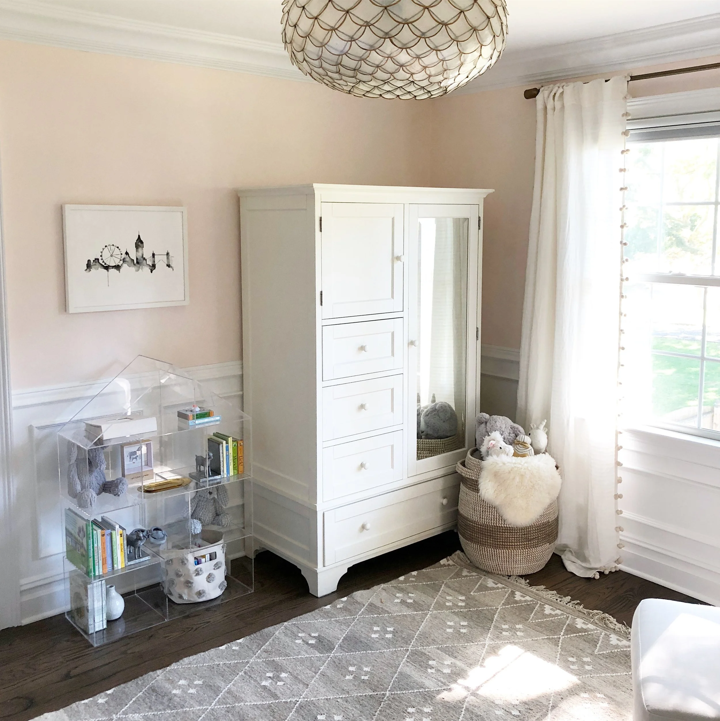
Walls are painted a pale pink and I was able to repurpose this beautiful armoire that we’ve had for close to 10 years. Add statement pendant lighting and the entire room was transformed!
One of the only new pieces of furniture in the room: this acrylic dollhouse bookcase, which was too cute to pass up. Artwork is a piece we had hanging in our Hoboken apartment a few years ago!
A simple neutral glider by the window and semi-sheer pom pom curtains (with blackout shades installed behind).
To cozy up this corner, I hung this white sailboat kite (yep, a real kite!). It’s neutral and whimsical and I like that it’s a unique alternative to a traditional mobile.
Despite having the armoire for 10 years, we were able to find the matching dresser, which makes for a perfect changing table. I chose a bone inlay mirror to hang above and a simple lamp for extra light.
Close-up of the tassel lamp and my favorite BannorToys blocks (which were originally Jacob’s and will still be “his” — but I’m planning to use them for monthly baby photos).
Close-up of the baby’s Cuddle + Kind collection <3
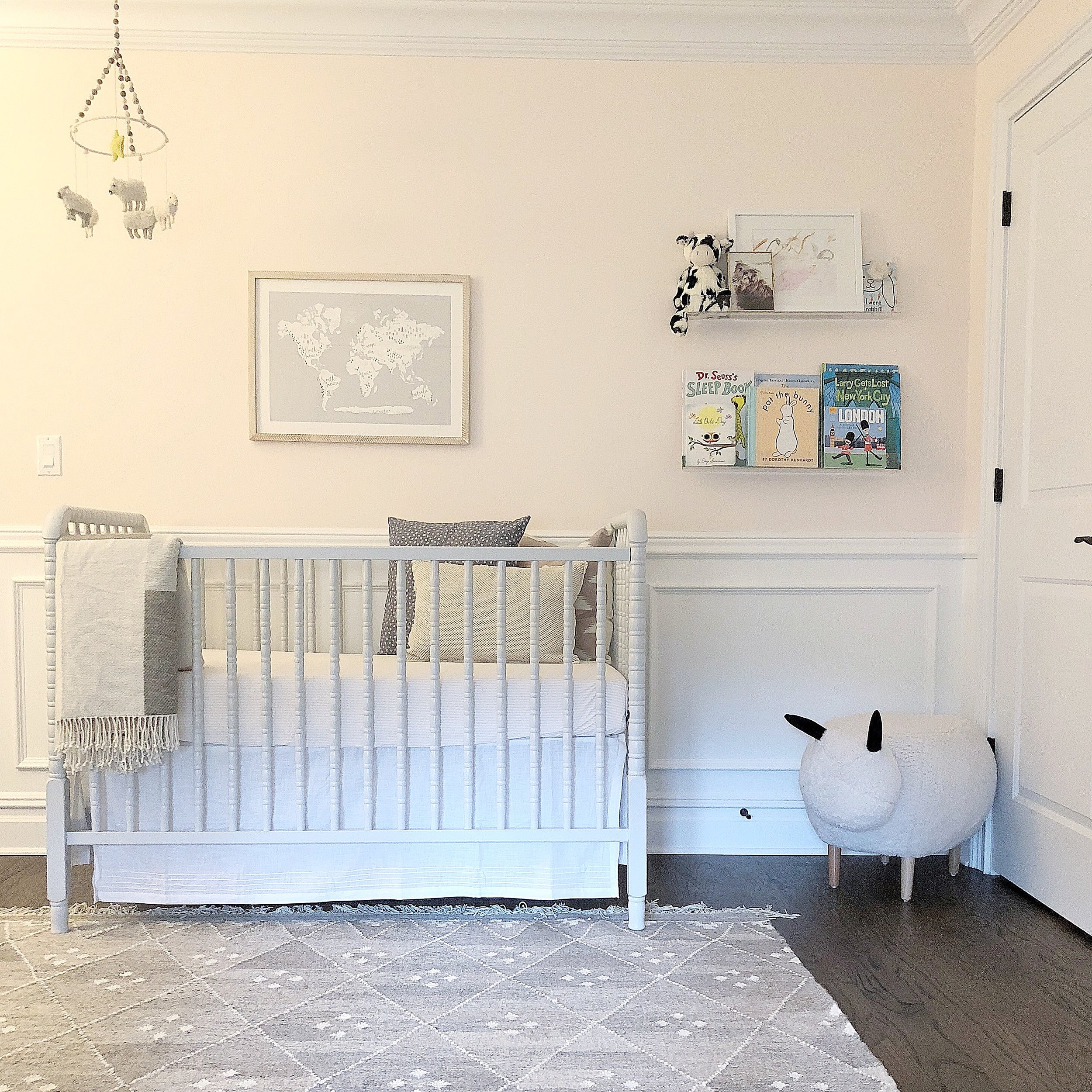
Light grey Jenny Lind spindle crib because both kids will be in cribs but I wanted to make sure that this one looked very different from Jacob’s (which is more modern and a bright white).
I chose this “Beautiful World” print to hang above the crib and repurposed Jacob’s old mobile, which I think works just as well in this room!
A set of acrylic bookshelves in the corner to create a mini reading nook. I also framed a watercolor that Jacob painted, which is currently leaning on the shelves.
And there you have it! I keep going back and forth on the wall color — some days I love the pale pink and other days (typically when it’s overcast), I think it’s a bit much. So we’ll see how long these pink walls last and if I decide to just paint over them at some point (or, if I can actually make a decision on some wallpaper, slap some up there!). But for now, a pink room for our little girl. Scroll down for a full source list!
Crib: Wayfair
Armoire: Pottery Barn (no longer available) but a similar one can be found here
Rug: Houzz
Acrylic Bookcase: Crate&Kids
Dresser: Pottery Barn
Mirror: Serena & Lily
Pendant Light: Serena & Lily
Glider and Ottoman: Pottery Barn Kids
Sailboat Kite: UncommonGoods
Acrylic Shelves: Amazon
Curtains: Anthropologie
Curtain Rod: Crate&Barrel
Lamp: Lulu & Georgia
Keekaroo Peanut Changer: Amazon
Dolls: Cuddle + Kind
London Print: Minted
Beautiful World print: Minted
Mobile: Pehr Designs
Throw Pillows: StitchedbyGrace here and here
Wooden Blocks: BannorToys
Baskets: Homegoods


