Baby Pulman's Nursery Reveal.
It's November and my due date is officially 3 weeks away(!), which means that it's time to finally reveal the nursery that I designed for Baby Pulman!
Right from the start I knew that I wanted to create a nursery that was a calm, inviting retreat from city life. A few months ago, I shared an inspiration board that highlighted the color scheme and a few items I was considering for the room. In the end, I actually ended up sticking pretty closely to that original board, designing a modern nursery in shades of blue, green, gray, and white.
Designing this nursery was easily the most fun project I've ever tackled, and the room is now my favorite in the house. Even our dog, Chewie, can't seem to stay out of it...
See below for photos of the nursery, some general tips I stuck to while designing, and a source list. I hope our son enjoys this room as much as we do! (P.S. check out the nursery on Apartment Therapy and Project Nursery!)
Create a room that fits with your home. While I wanted to design a fun, whimsical nursery for our son, I was also careful not to create something that would seem too babyish or that wouldn't fit with the rest of our house. While there are plenty of children's items in the room, the majority of the furniture came from stores and collections already found throughout our house. For example, instead of a traditional changing table, we opted for a full-size dresser that actually matches bedside tables in our master bedroom. Not only does the dresser provide a ton of storage, but it also gives us the option to move it to another part of the house in the future.
Make do with what you have. Since we moved into our home just two short years ago, there wasn't any need to renovate the space. We even decided against repainting the room and kept the wall color (Benjamin Moore's "Silver Crest") that we chose when we first moved in. While we purchased plenty of new items for the nursery, we also incorporated a few existing pieces of furniture such as a chiffonier that used to be in the master bedroom and a sleeper sofa and table lamp that were once a part of the guest room.
Incorporate DIY. To make the nursery extra special, I added as many DIY touches as possible. I refinished a rocking horse that was mine when I was a toddler and repainted a tiny rocking chair that was a gift from my grandmother for my first birthday. I took a stab at creating my own nursery art by writing and framing a favorite Peter Pan quote, and even reupholstered an old bench to create seating beneath the floating bookshelves. Each of these were fun weekend projects and have really helped to make the room unique.
Design around a focal point. As soon as we found out we'd be having a boy, I created an inspiration board that really helped to keep my thoughts and ideas in on track. The wool dhurrie rug that I pinned to my board ended up being the very first item I purchased and helped to set the tone for the rest nursery. I'd recommend choosing one piece of furniture or an accent that you absolutely love (such as a colorful rug), and then plan the rest of the room around it.
Sources:
- Floating wall shelves: West Elm
- Velvet lumbar pillow: Pottery Barn
- Rocking chair: my own DIY
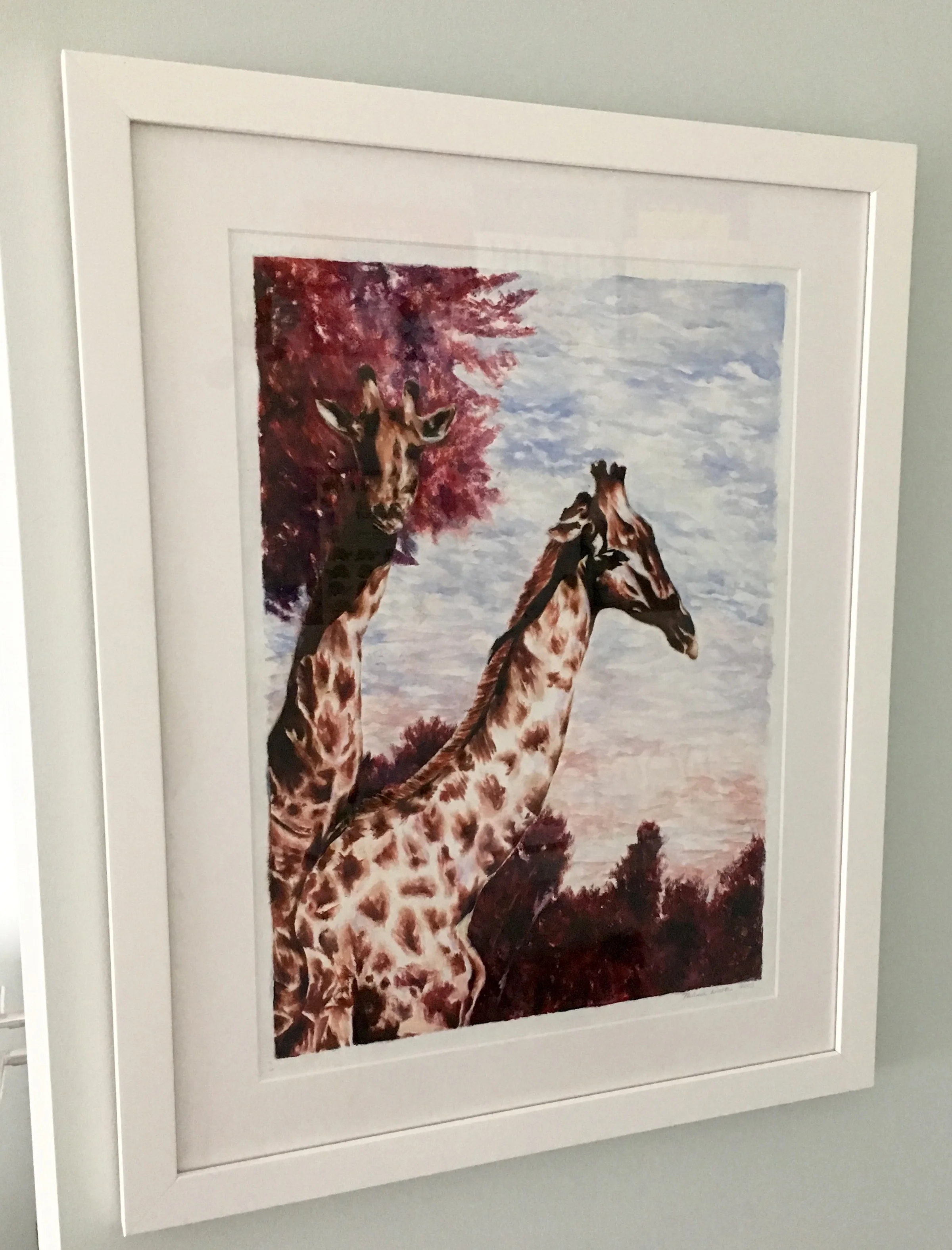
- Giraffe watercolor: painted by my sister
- Elephant nightlight: Jonathan Adler
- Wool dhurrie rug: West Elm
- Chiffonier: Pottery Barn
- Rocking horse: my own DIY
- Curtains: Pottery Barn Kids
- Sheep mobile:
- Crib: Serena & Lily
- Print: Serena & Lily wallpaper sample (currently used as a placeholder until we have baby photographs to frame!)
- Framed Peter Pan quote: my own DIY
- Wool & felt animal bookends: RH Baby&Child
- Llama photograph: Gray Malin
- Moroccan pouf: Overstock.com
- Mirror: Pottery Barn (no longer available)
- Dresser / changing table: Pottery Barn
- Colored glass table lamp: Pottery Barn
- Peanut changing pad: Keekaroo
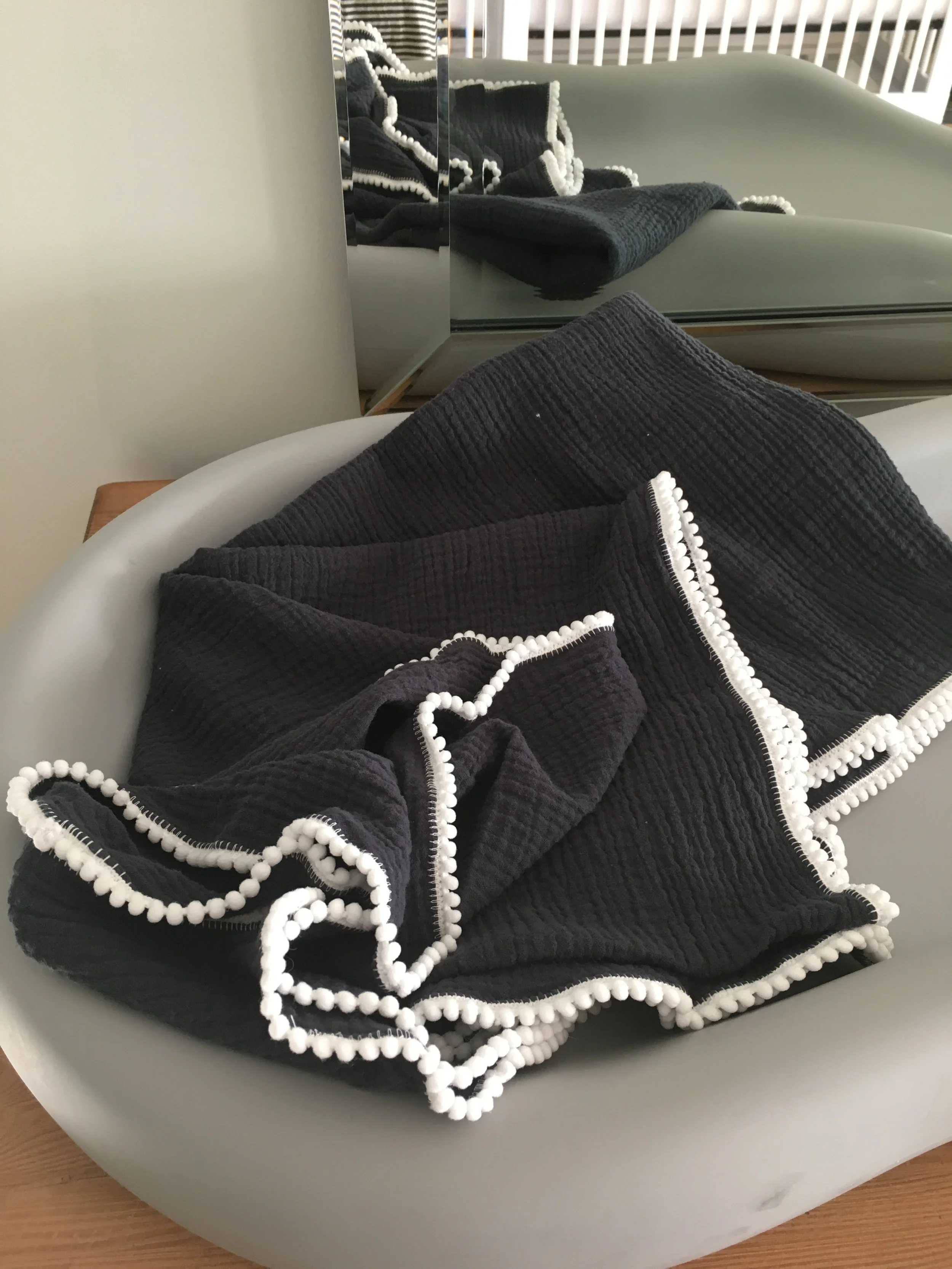
- Pom pom baby blanket: CharleyCharles Shop
- Basket: Homegoods
- Large bunny Print: Minted
- Sofa: West Elm
- Faux sheepskin throw pillows: Pottery Barn
- Pom pom throw pillows: West Elm


